My Role
I was the lead designer responsible for driving the initiative and creating a visual style that harmonizes with ABC's brand. The following were the main areas of focus:
Insights and Ideation - I conducted kickoff meetings with various stakeholders to find pain points. From viewing user testing revolving around key tasks, I was able to find what areas needed the most work.
Design Principles & Brand Voice - By defining business goals and key metrics, we developed a set of design principles and content strategy. This helped gain alignment to stakeholders and executives to help drive empowerment.
Brainstorming - By breaking the main data drivers down into behaviors: discovery, habituation, show experience and playback we could then develop features and improve behaviors loops to help the ux and improve business goals.
Planning and Iterative Cycles - Taking the main behaviors into consideration, the product was broken down into iterative cycles. I prioritized the iterative design methodology with the path of lease resistence with the user and development process in mind.
Execution - I created design specs, test cases, high fidelity visuals, prototypes and motion studies to help facilitate direction to stakeholders.
Ownership - I led and set up kickoff meetings to gain internal awareness, conducted weekly check-ins and created an iterative approach by designing up from the current site in phases.
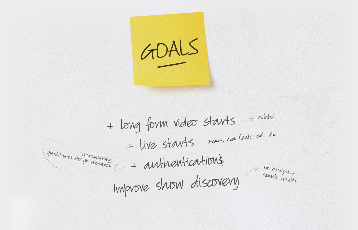
Goals
The following are the goals that we aimed to improve.
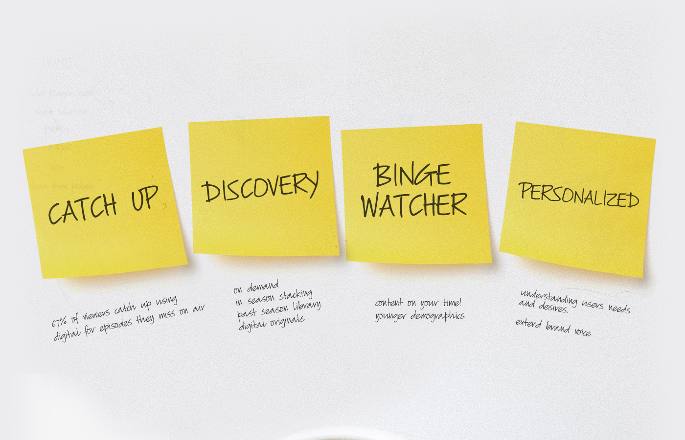
Insights
From meeting with the consumer insights team, viewing existing research and meeting with various internal teams, I was able to break down the data into the following segments.
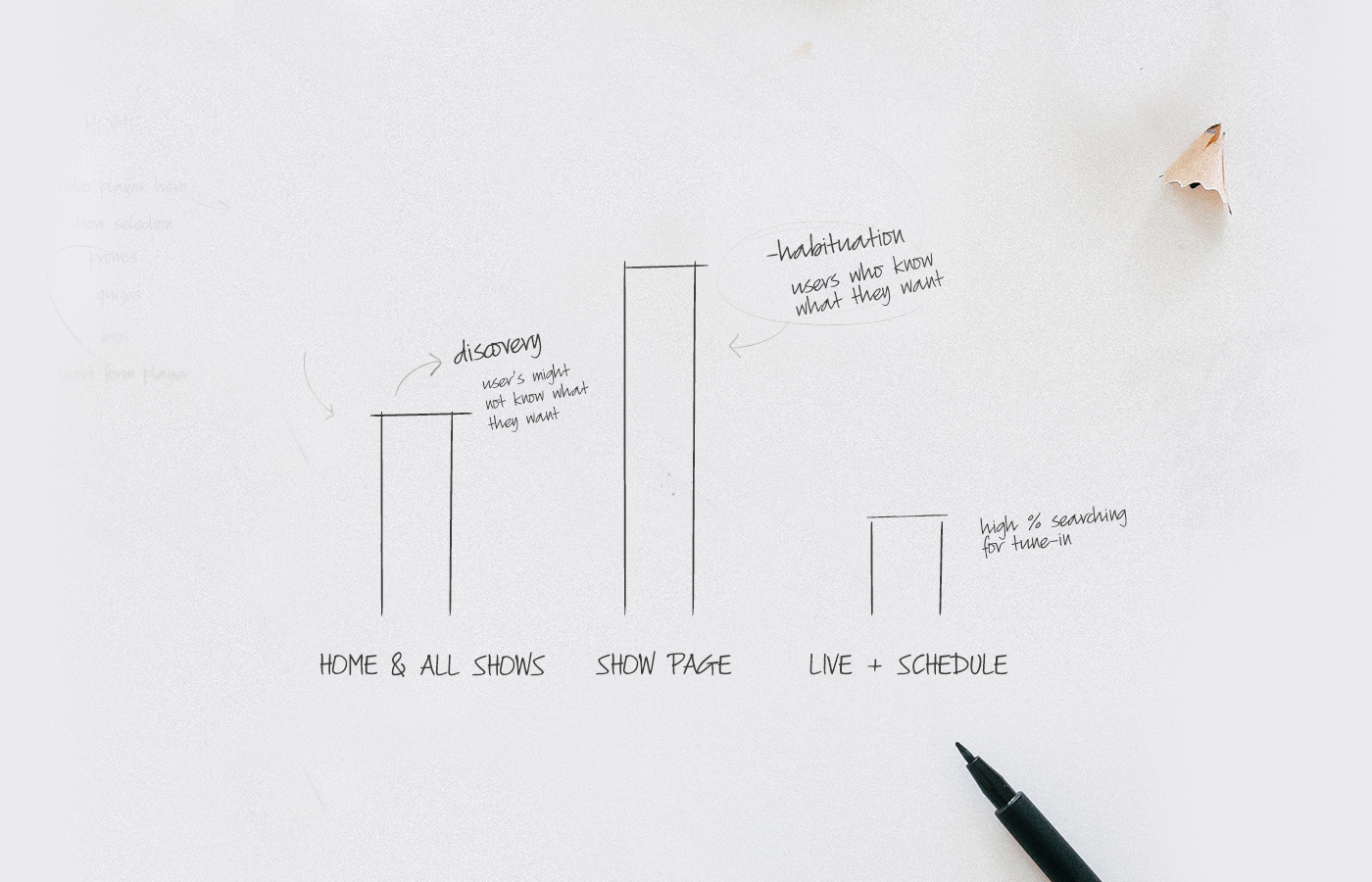
The Data
Where does the traffic go? Majority of the traffic goes to a specific show page. 30% goes to the home and all shows pages while 10 percent goes to the live page and schedule page.
Brainstorming
From looking at the data and analyzing market research and customer insights, we broke this data up into segments and behaviors to further explore features and ideations in the form of user stories. These included discovery, habituation, playback, show experience and brand eco-system.
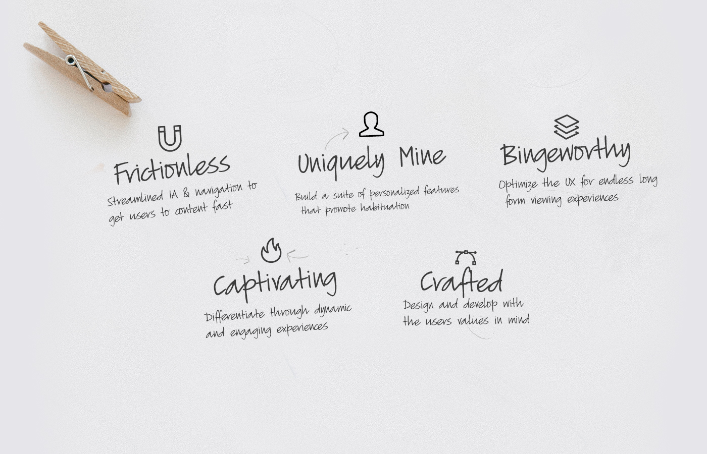
Design Principles
This project touched many different teams. I met with various stakeholders from all different teams to gather and manage their feedback. We established a set of design principles to create a common language and what we and our users value.
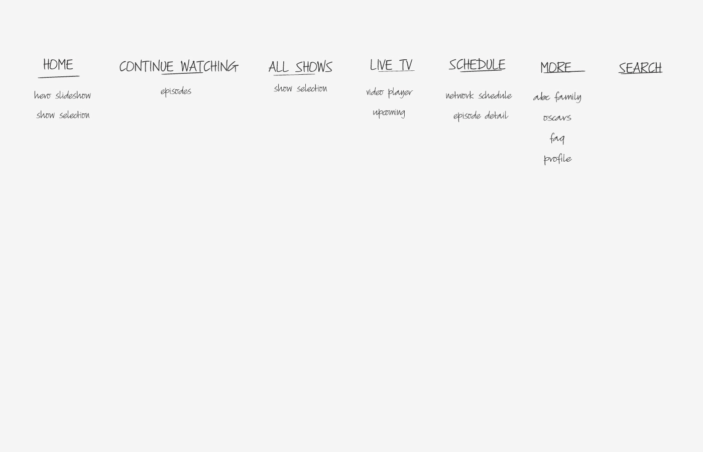
The New Homepage IA
The new IA catered towards a home towards personalized discovery experience that brought new content to the user based on time of day, day of week and other parameters.
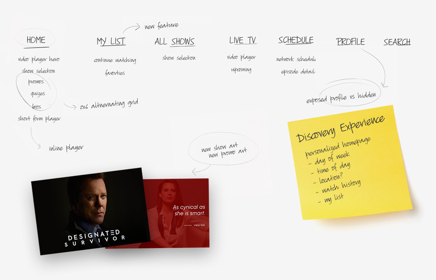
The discovery experience.
A&B Testing
By leverage optimizely data & pathing data, I had the hypothesis that if we exposed the navigation we could better serve the users by getting them to content faster. I started by analyzing current data then designed a new navigation, exposing certain items. This is what I discovered: Initial Findings (example A) - Menu Icon had a high number of clicks and watch live had a high number of clicks but a high exit rate. Discovery (example B) - Live TV had a lower exit rate and less clicks while the schedule had a higher number of clicks. This concluded that users were visiting the live page to look for the schedule. Continue watching also resulted in a high % of clicks as well.


Iterative Updates through testing
Playback Improvements
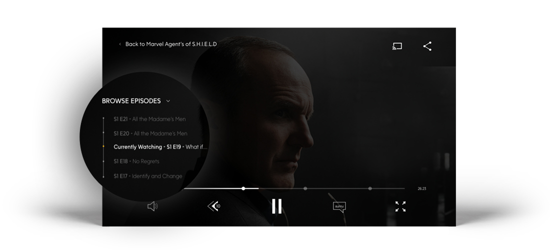
One of the most obvious challenges for our users was the ability to jump between episodes to consume content quickly. I hypothesized that if we were able to switch between episodes while in playback, we could improve overall satisfaction and improve exit rates on the episode guide page and video detail page.
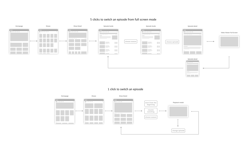
How does this look?
By exposing the spinner, the user has better control over switching episodes just incase they forget. You have the ability to see two previous episodes, the current episode, and two latter episodes
Seamless Experience
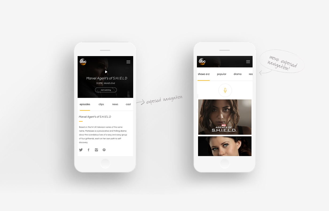
By introducing a gesture based exposed navigation, the mobile site was designed to seamlessly take the user to the next section by swiping.
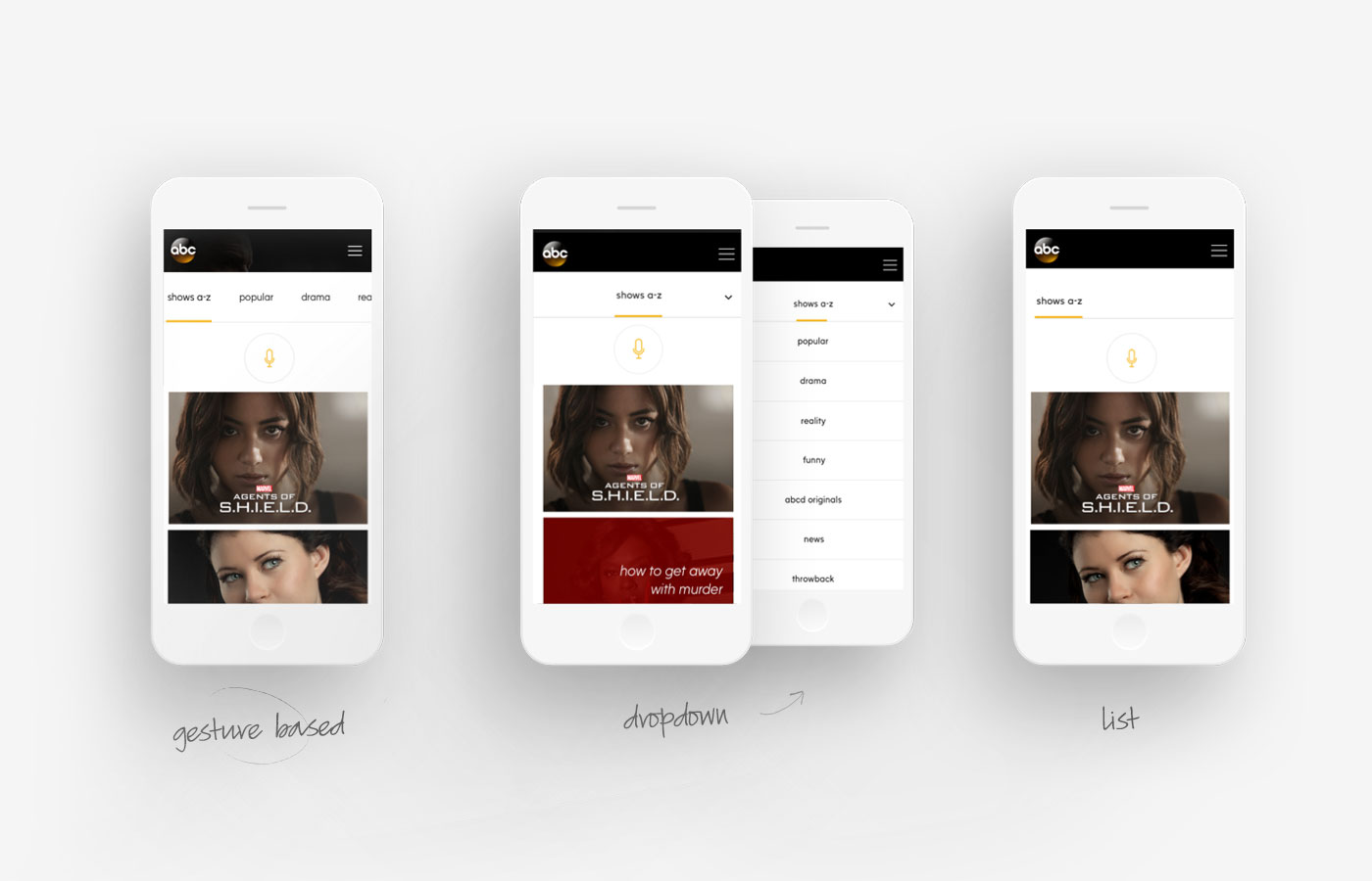
Design Pattern Considerations
Alternate design explorations for browsing between show categories to improve usability.
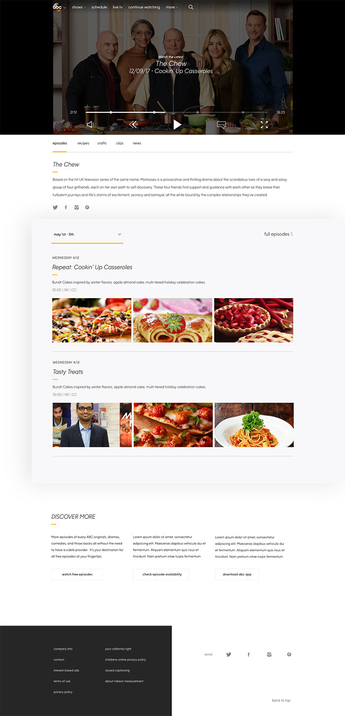
The Show Experience
Some of the key improvements were: Surfacing content that isn't available and educating the users where to find the content if it's not available on the site. Video in front and center where the user has the ability to continue watching, start from the beginning or replay. Gesture based subnavigation was exposed to provide a frictionless experience that promotes habituation and discovery.
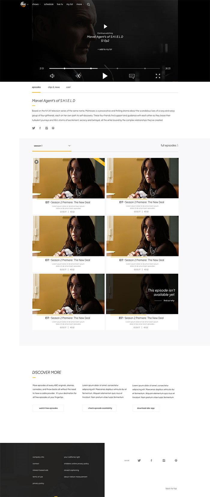
The Daytime Show Experience
Alternative versions of the show page were created to be able to cater to various shows and audiences.
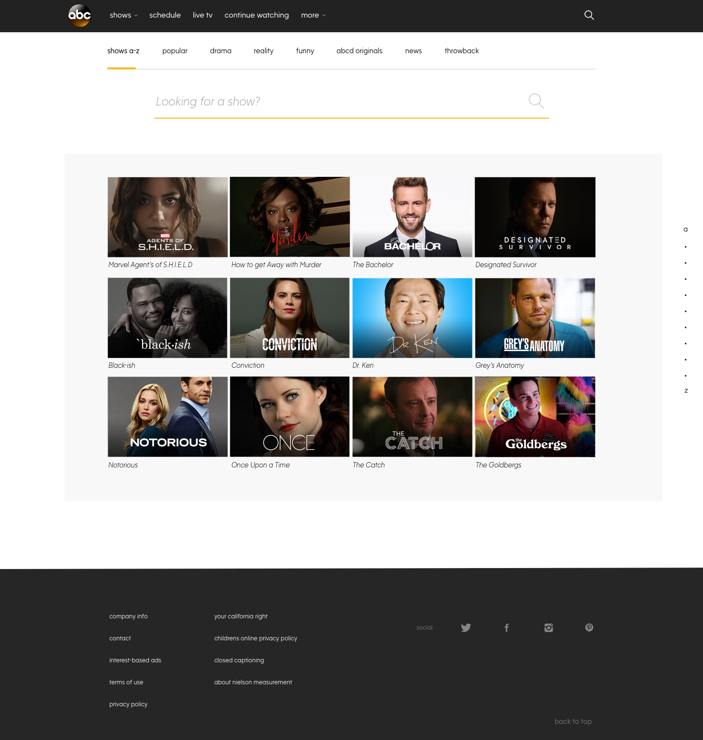
All Shows Page
Ability to swipe between categories Genre based sub-navigation New show art that features consistent placement of logos and the main character front and center Search by voice recognition
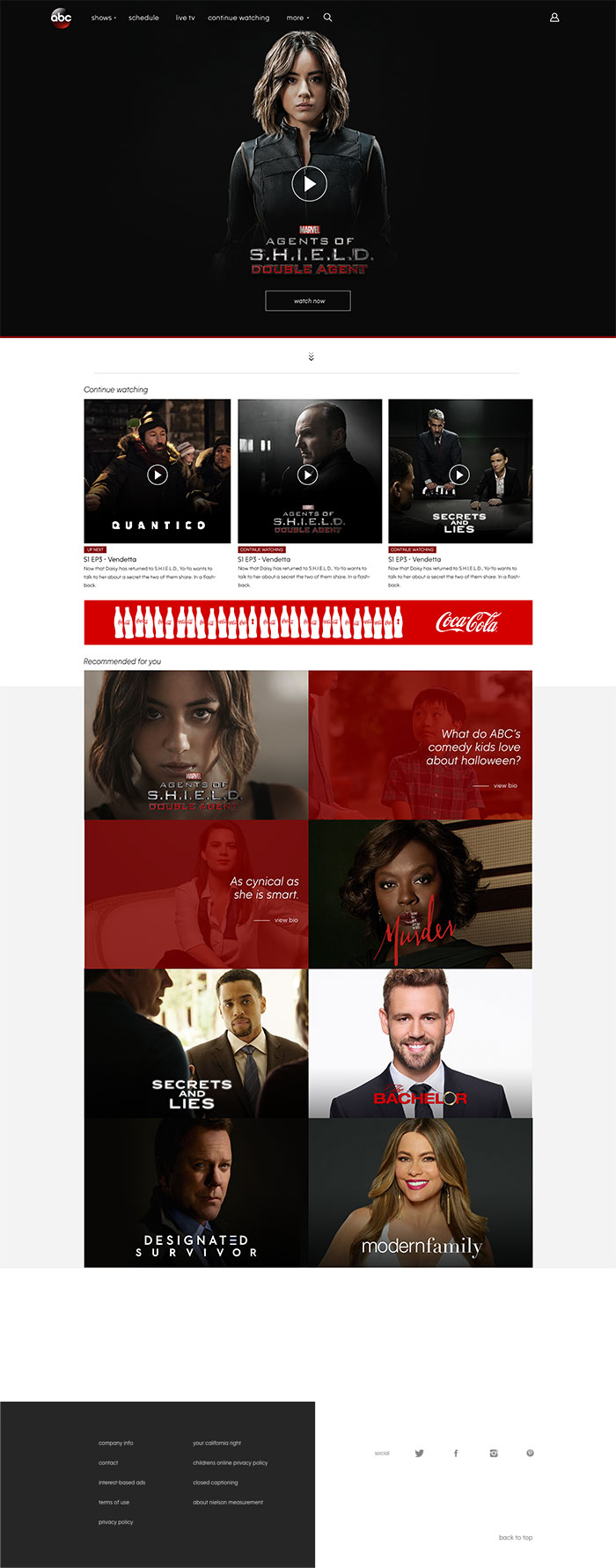
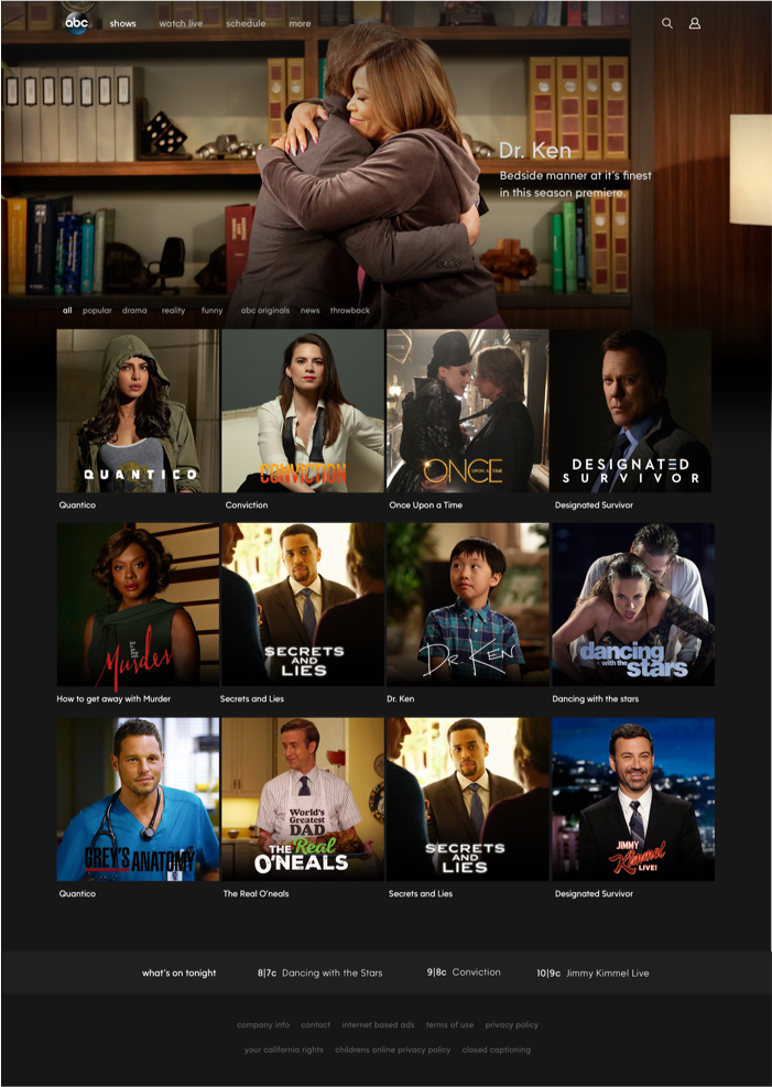
The Homepage
Video on the homepage - think subtle movements with the ability to feature an inline player front and center Pick up right where you left off with continue watching Multiple outlets of content with personalized content recommended to you. Other areas of content such as bios or quizzes to boost engagement.
Early Explorations
Displaying a few early explorations on visual treatments.
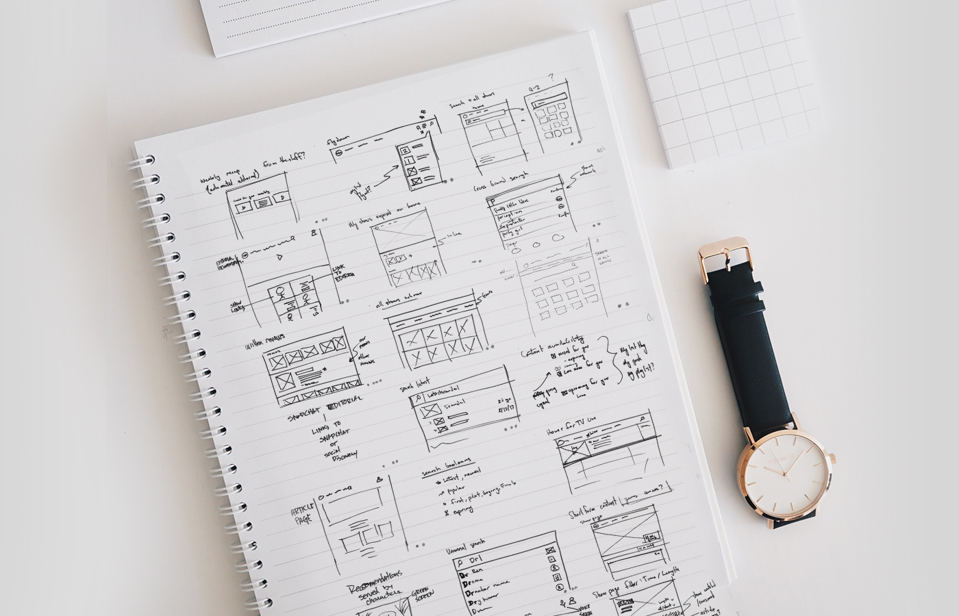
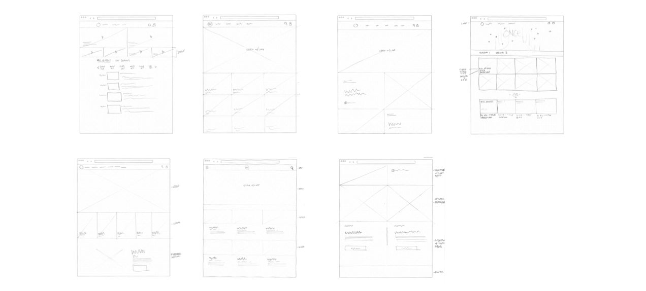
Sketches
Sketches from my initial layout ideas and visual hiearchy.
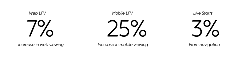
KPI Improvements
After analyzing metrics from time periods... There was an oustanding growth on the mobile market.