My Role
These were concepts for features, areas of testing, navigational patterns and visual designs that I worked on during downtime. I saw the need for ABC's android app to adopt areas of material design and being featured in the google play store By focusing on discovery, habituation and show experienece, I brainstormed various features and layouts to help improve abc's android platform.

Exposed VS Hidden Navigation
I conducted an A&B test comparing hidden vs exposed navigation. We asked users to complete various tasks such as finding the most recent episode of a show, finding their favorite show and more. From here I timed how long it would take a users to complete the task. Pathing was also recorded to find the most popular path.
Results
Average task time resulted in 15% seconds slower when the navigation was hidden.
There was a 20% drop in content discoverability when compared to exposed navigation.
It took the user -2 seconds difference in finding the navigation from exposed to hidden.
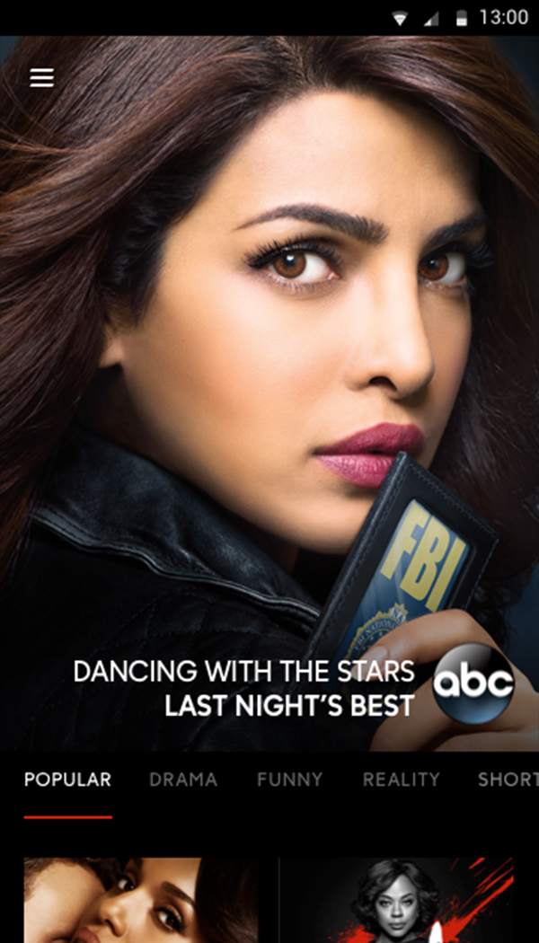
The Landing Experience
The home experience accounts for amount of traffic. Majority of the users that are coming here are coming for discovery so we cater this for discovery of new content.
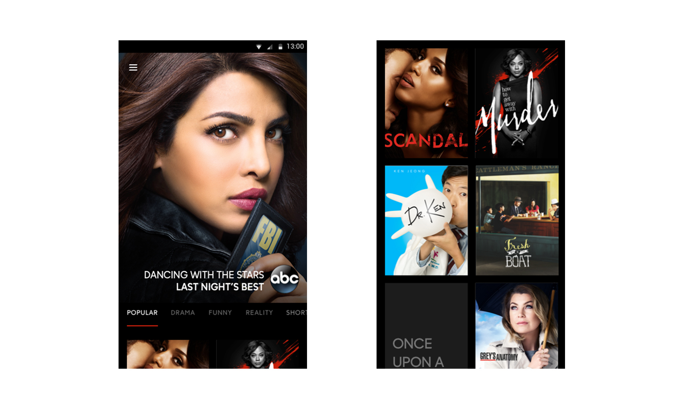
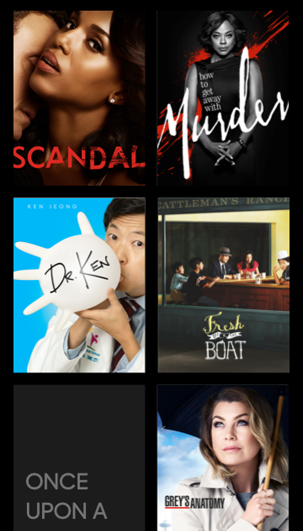
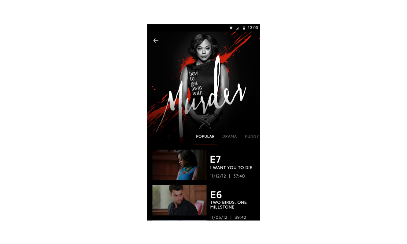
The Show Experience
Each show had it's own show page which featured the key art from that specific season along with the ability to watch all episodes right on your smart phone.
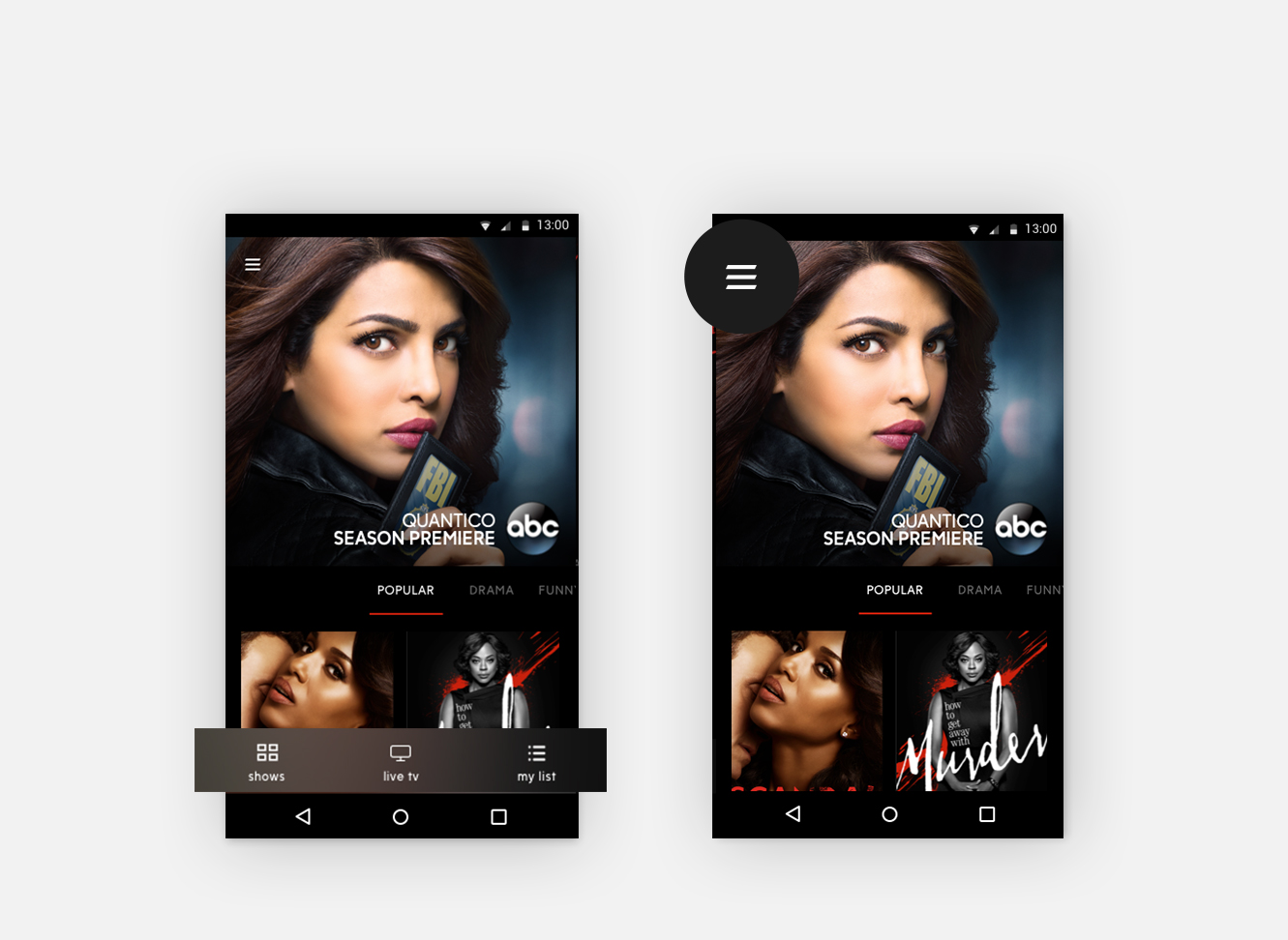
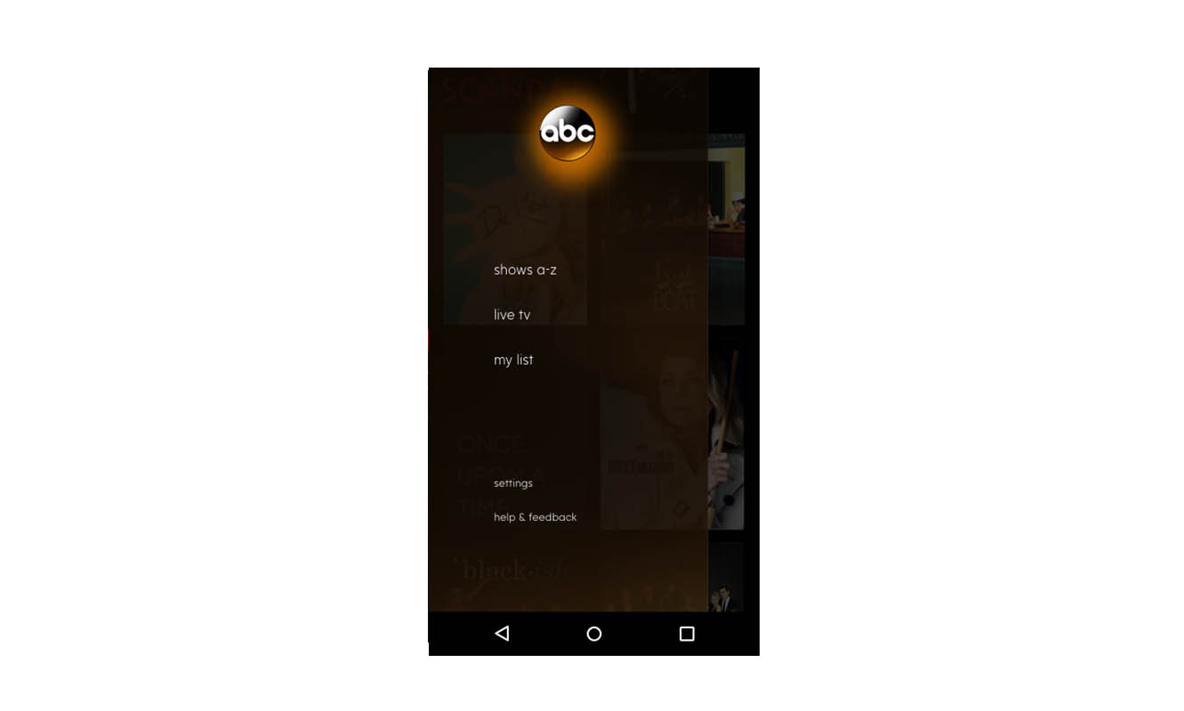
The Navigation Drawer
A navigation drawer providing access to shows, live tv, my list, schedule, settings and help and feedback.
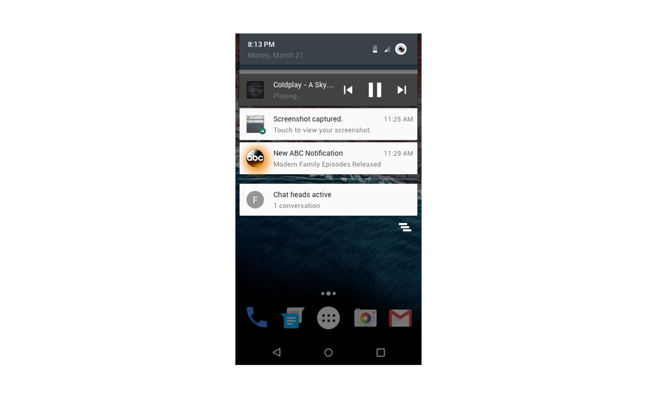
Push Notifications
As a successfull take away from brainstorming meetings, push notifications provide a way to increase habituation and provide a direct path of communication with the users. By providing the proper value, push notification control and proper analytics. Users were encouraged to opt in by offering them incentives.